Punch Holes and Dynamic Islands
When I moved into a leadership role at my first start-up, I was recommended to read “Leadership is an Art” by Max Depree. One of the fist sentences in this book always stuck with me:
The first responsibility of a leader is to define reality.
Huh? What do you mean “define reality?” Reality is just there, right? It doesn’t need defining.
What can I say. I was young and naive. I knew nothing.
I’ve since learned that reality doesn’t exist.
Is something a problem, or a challenge?
Is something a failure, or a learning opportunity?
Are we firing somebody, or promoting them to customer?
“Reality” largely depends on your perspective and attitude. Except in that last example — that’s just being a dick.
During my first day at a new job, one of my new team members told me:
“I don’t like managers. It’s their job to manipulate. I don’t like being manipulated.” That’s Polish honesty for you. Welcome to the company.
The definition of “manipulate” he referred to is this one (3):
to change by artful or unfair means so as to serve one's purpose
Manipulation has negative connotations. This comes from the unfair part of this definition, as well our general suspicion around “serve one’s purpose.” Because: who’s purpose are you serving, dude (or dudess), what’s your agenda?!
So rather than using the term “manipulation” I prefer the term “framing.” Sounds much nicer, doesn’t it? Or did I just manipulate you?
But yes, new team member, I can agree: framing is a big part of my job.
Framing is about putting things in a different light, a different perspective. With the explicit goal to turn a bad thing into something good, constructive, even an opportunity for creativity.
Bonus points for doing this in an artful fashion.
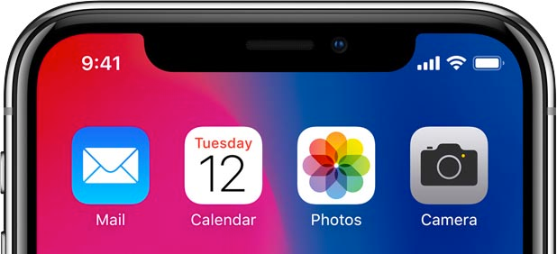
When Apple worked on the iPhone X some years ago, the ambition was to build a phone with a screen that would stretch to all corners of the device. However, they faced a problem (some would frame it as a challenge): where do we put the front-facing camera, depth sensor and other fanciness that we need to also launch Face ID (allowing users to unlock their phone based on the credibility of their smile)? The compromise they came up with is what is generally referred to as “the notch”: a small cut-out at the top of the screen. It wasn’t ideal, but it was the best they could do.

While many other phone manufacturers have since adopted the same solution, some have attempted to innovate on this concept.
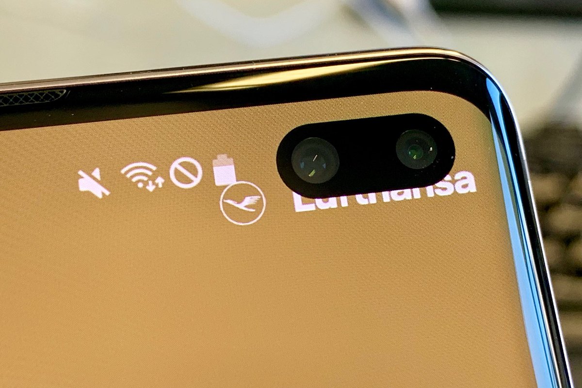
Most notably, Samsung introduced something interesting with the Samsung Galaxy S10. Rather than a notch, they managed a to create a smaller cut-out around the camera — or as it’s been lovingly called: a punch hole — that’s not at the edge of the screen, but a bit lower.

On the iPhone side (and more recently even on the Macbook Pro) for the longest time, the notch was just there. It didn’t change.
However, then, something happened. Apple figured out a way to reduce the size of the camera and sensor system, and experimented with placing it a bit from the screen corner — similar to the s10 design, just wider and centered.
This idea came to fruition with the iPhone 14 Pro, officially launched this past Wednesday. As often happens, the new design of the phone leaked before. In articles on this leak, the new camera cut-out was generally referred to as the pill.
However, Apple did not launch the pill on Wednesday. Because something had happened.
At some point a light switched had switched on in somebody’s head at Apple.
“What if...” this person had asked themselves.
What if we don’t look at this as a hardware constraint (a.k.a. “a problem”) we cannot seem to get rid of?
What if we can turn this into something fun. Something useful?
What if we can turn this punch hole into a platform?
On Wednesday September 7th around 11:07am PT, Apple did not introduce the pill, nor the punch hole.
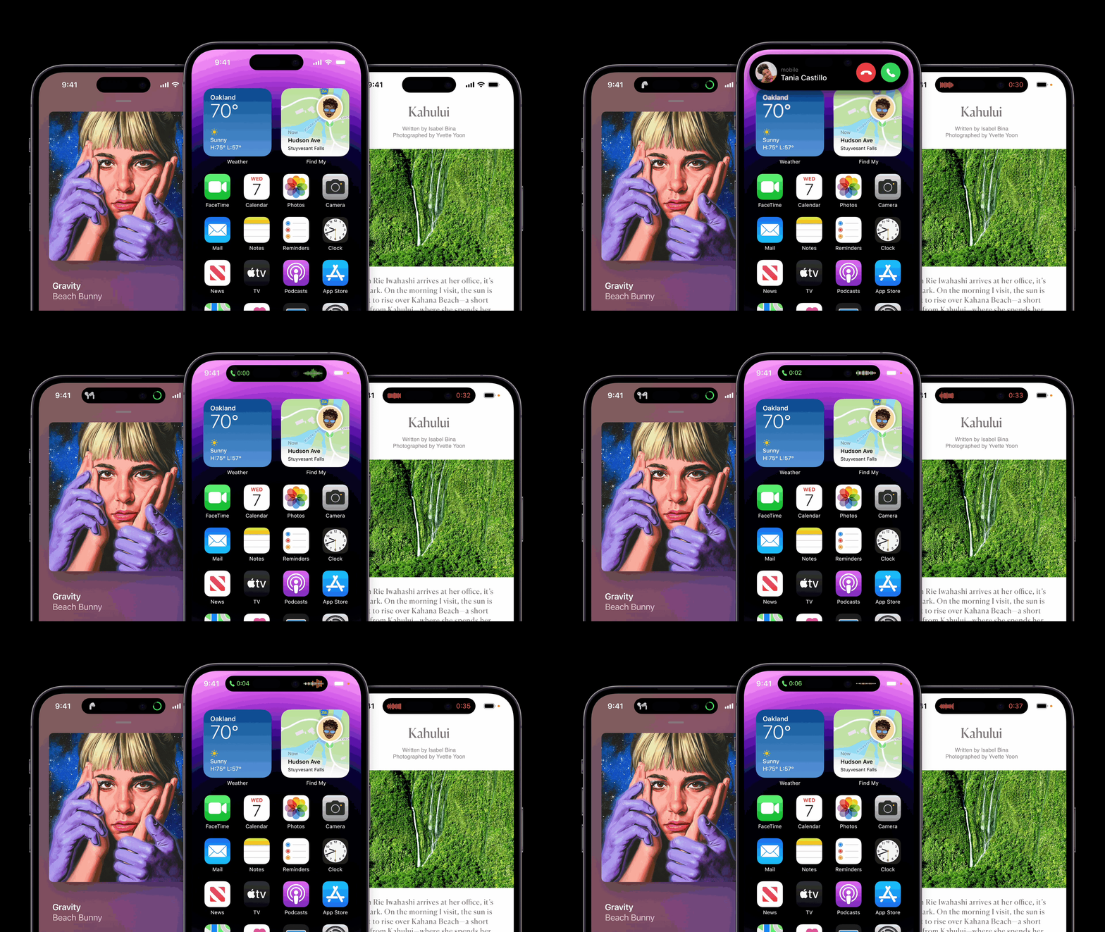
They introduced the dynamic island.

While the initial press response was laughter, it quickly changed to intrigue. “This is actually pretty clever...”
The dynamic island is a integrated part of the iOS UI that can dynamically expand based on the context. By default it’s a black pill in the center of the screen (housing the camera, speaker, sensors etc.), however if you have a timer running it expands to the sides and shows you the running time. When you connect your Airpods, it visually confirms the connection as well as showing its battery level. If you are on a call, it shows call time and status. When you tap the island, it expands to reveal a more elaborate UI with more controls.
On top of this, it’s a platform. Developers will be able to build their own animations and widgets around this dynamic island.
So what is reality?
Reality changed when somebody at Apple started to frame this as something more than just a punch hole. Creative juice started flowing, and as a result we got ourselves the dynamic island.
However, let’s not exaggerate the expected impact of the dynamic island on the world — he said after spending over a thousand words on the topic. In the end, it’s still just a bunch of mostly black pixels around a punch hole.
The real significance is the importance of framing.
I can’t stop thinking about how I can turn more of my punch holes into dynamic islands.
